










Hotspot Widget
Back to All Guides
GET IN TOUCH
If you would like to get further information about Frog or help in getting it set up in your school please get in touch via the contact details below...
hello@frogeducation.com
Hotspot Widget
The Hotspot widget allows teachers to create interactive pictures, targeted at increasing student engagement.
Hotspot Widget
The use of the widget can range from a lesson tool used as part of group discussions or as part of a student's independent learning/review of a subject. In addition, the Hotspot widget also allows linking to additional content such as:
-
Another site within your Frog platform
-
A specific page within your site
-
A URL to an external resource/website
-
A media file such as an image or video.
Once you have dragged and dropped the widget onto your site, you will then need to select the Hotspot widget when it is on your site in order to display the widget configuration settings within the Widget tray.
Creating Hotspots
 In order to create your Hotspot you will need to select the "Create Hotspot" button from the widget settings. After selecting the "Create Hotspot" button, you will need to upload an image via one of the options below:
- Upload - This option allows you to upload an image file from your local device.
- FrogDrive - This option allows you to upload an image from your "FrogDrive" > "Documents" area.
Note: After uploading your image it will display in its full pixel resolution, so you may need to scroll to see all elements of the image which is expected behaviour.
The next step is to create a Hotspot area within your image that will provide additional information to users. You can choose to add as many hotspot areas as desired. To create a hotspot area click on an area within your image and drag your mouse to create a box, which will be highlighted in a light blue shade. To resize the hotspot area, select one of the corners and drag this to increase / decrease the hotspot area as required.
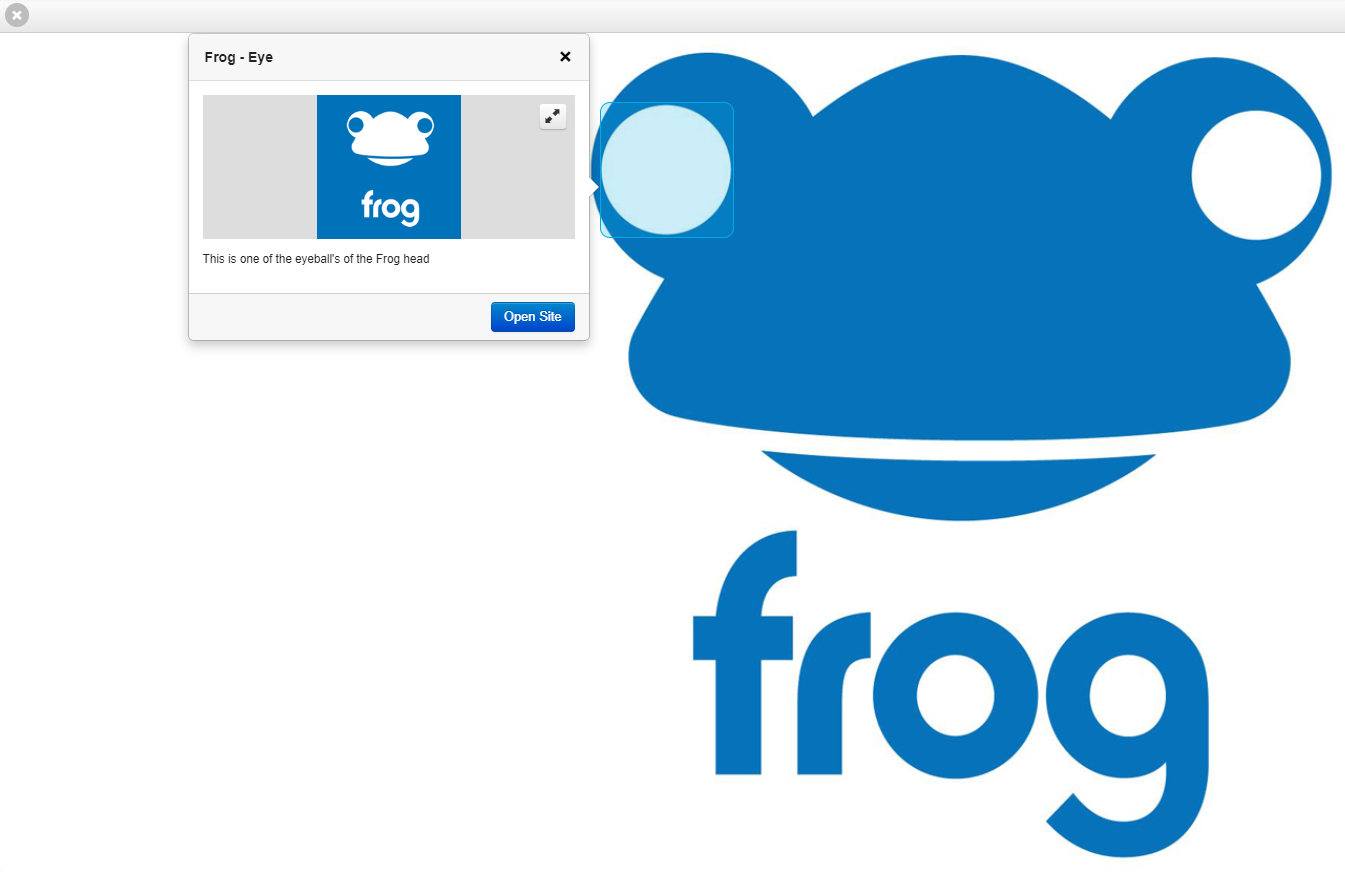
Once you are happy with the placement / size of the hotspot area, click within the hotspot area to have a popup box providing two methods in which to provide additional information to users:
- Popover - When the user clicks on the hotspot area a pop up window will display the additional information to the end user
- Link - When the user clicks on the hotspot area depending on the link option selected the user will be redirected accordingly.
Below are the available link options:
- Site - Ability to link to another site within your Frog platform Page - Ability to link to a specific page within your current site
- URL - Ability to link to an external resource via a URL
- File - Ability to link to a media file such as image or video.
Popover
We are first going to look at creating a Popover for the hotspot area. By default, the Popover option is automatically selected, and we can see a number of available options that can be configured.
The first of the configuration options is to give your Popover a title. The next configuration option is the ability to add an image to display within the Popover. The image can be uploaded via one of the methods below:
- Upload - The option allows for a media file (e.g. image or video) to be added from their local device
- FrogDrive - This option allows an image to be added from your FrogDrive > Documents area
- Discover - This option allows you to search within the Discover application across various 3rd party content providers and add an image from the returned search results.

The next configuration option is the ability to add text to display within the Popover.
Note: Any text entered is displayed as plain text and cannot be styled (bold, underline, italic etc).The last configuration option is the ability to add a link to additional content. The link options available include:
- Site - Ability to include a link to another site within your Frog platform
- Page - Ability to include link to a specific page within your current site
- URL - Ability to include a link to an external resource via a URL
- File - Ability to link to a media file such as image or video.
Once you are happy with details entered into the popover, select the Save button. You will then be presented with a preview of the popover and all associated content is displayed.  Should you wish to edit any of the content displayed within the popover then select the Edit button. When you are happy with your hotspot areas select the X button located in the top left corner of your image. The Save Changes popup window will be displayed with the following available options:
- Cancel - You will be taken back to the image allowing you to create another / edit a hotspot area
- Discard Changes - The uploaded image as well as any hotspot area / content will be deleted
- Save & Close - All of your changes are saved, and the uploaded image displayed within your site. You will also be returned back to the Hotspot widget settings.
Advanced settings
You can set a maximum height for the image by using the "Set a fixed height" option which this is set to OFF by default, meaning the height of the image will auto adjust.  If you want to set a fixed height for your image, slide the toggle to ON and enter in a pixel height for the image. The image will immediately update and reflect the new height settings entered.
The next configuration setting within the Hotspot widget is "Use as control" which is to be used when the site has Display mode set to Presentation.
By default, this option is disabled meaning that everything works as already outlined in the above.  This option will force the users to click on all areas of the Hotspot widget before letting them continue with the presentation, as the "Next" button will not be displayed until this has been completed by the user. When this option has been enabled a message above your image is displayed above the Hotspot widget that reads "You must find all hotspots to continue".
The last configuration setting within the Hotspot widget is the option Popout viewer, which open the image associated with the Hotspot widget in a full screen preview mode. This option is disabled by default.
Note: If you have the Set a fixed height toggle set to ON, and select the option Popout viewer, the pixel value set for the height of the image will not be applied.
When the Popout viewer option is turned ON your image will be greyed out and a message of "Tap to Open" will appear over the Hotspot widget.
When the user selects the image, it will launch in full screen preview mode.