Back to All Guides
GET IN TOUCH
If you would like to get further information about Frog or help in getting it set up in your school please get in touch via the contact details below...
hello@frogeducation.com
Forms
Forms allow you to create simple web forms in a quick and easy way selecting from a series of question types for educational or administrative purposes.
Creating a Form
Forms allow you to create simple web forms in a quick and easy way selecting from a series of question types for educational or administrative purposes. You can collect information from other users of the platform and then extract this information out of the Frog platform for use with other systems or for further analysis.
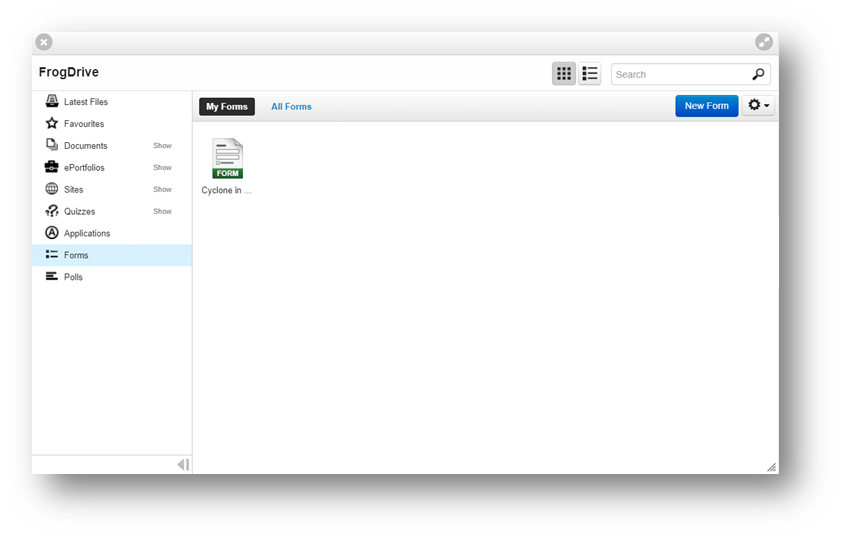
Forms are created and managed using the Form builder. The Form builder can be launched from the Quick launch menu or by opening your FrogDrive and selecting Forms.
You can also access the Form editor from the Form Widget, add the widget onto your Frog site and then view the Settings tab of the Edit panel while the widget is selected. Within the Settings tab select the New form option.
Form Editor
The Form editor is used to create and manage forms. The Form editor is accessed from your FrogDrive when viewing Forms or from the Form Widget when opting to edit a form from within a Frog site.
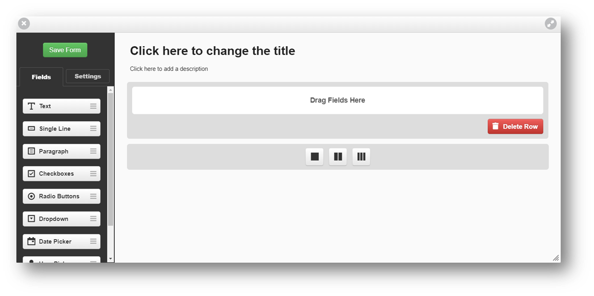
The Form editor consists of two panels. The Field palette and Settings panel, located on the left of the editor and the Form canvas located on the right.
Form settings
When no fields are selected the Settings tab will display global settings for the form being edited. The following settings can be selected for your form:
- Form name - This option controls the name that is displayed on the form as well as the name displayed in your FrogDrive. This option can be edited in the Settings panel or directly on the form canvas
- Form description - This option controls the description for the form as is displayed on the form. This option can be overridden using the settings on the form widget
- Label alignment - This option controls whether the labels for each field will be placed on top of or beside them. The settings for individual fields can be viewed by selecting a field and then selecting the Settings tab
- Field palette - Selecting the Fields tab from the left of the editor opens the Field palette, displaying all fields available for use in the form. To add a field to your form, drag and drop the field from the Field palette to the Form canvas. Once a field is placed on the canvas, the settings for that field can be viewed by selecting the Settings tab. If you wish to view a different field’s settings, select that field and then select the Settings tab. Each field has its own settings as well as some common elements.
Common Field Elements
- Label -This option controls the text displayed next to a field, naming the field in your form
- Required and Hidden field - These options control whether or not this field is a required or a hidden field. A required field must be completed before the form can be submitted. If you attempt to submit a form without completing a required field you will be asked to complete the field before the form can be submitted. Required fields are displayed with a red * after their label. Selecting the hidden field will keep that field hidden from users until the Form has been submitted.
- Description - This option allows you to configure a description for your field. This description is displayed directly below the field and may be used to give further information on what the field is asking or what the information collected is for Hint text - This option applies only to text input fields.
- Hint text can be specified that is displayed by default in the input area of the field. This text is not a default entry and when the field is selected the hint text will disappear.
Specific Field Elements
- Text input field - The Text Input field type allows you to create text and place it into your form
- Single line text input field - The Single line field type allows you to collect data in the format of a single line of text, for example requesting a telephone number, name or favourite book
- Paragraph text input field - This text input field allows you to collect data based on multiple lines, for example an address
- Checkboxes - A checkbox allows the user completing the form to tick or untick a box to answer a question in your form, for example choosing a number of books that they have read from a selection of listed items. Checkboxes in a group will allow the user completing the form to select more than one answer
- Radio buttons - A multiple choice field type allows you to place a radio set in a page from which a user can only select one answer, asking users to select their preference from preferred meals for example. The radio set has a minimum of 2 answers
- Dropdown - This field type allows you to add a drop down menu to your form. The drop down menu must have at least 2 answers
- Date picker - This field type allows the user to choose to add a date to the form
- User picker - This field type allows the user to pick a user to add to the form and contact them by email
- File upload - This field type allows the user to upload a file to add to the form.
Interacting with Form Elements
Once some fields have been placed on the canvas a number of changes can be made to them directly. The form name, description, field label texts, field hint texts, and some option values can be amended directly on the canvas.

When a field is selected it can be deleted using the Delete field button and moved using the Move field button to drag the field higher or lower in the order. If you choose to delete a field, a confirmation prompt will be displayed asking you to confirm this action. If you are editing a form that has been submitted by users, the data from this field will be lost. Once you have completed your form select the Save and close or Save and use option to complete editing of the form and return to your site or the Form builder.
Sharing Forms
To share a form so that others can fill it in you must first place the form within a Frog site. To attach a form to a Frog site, create a new Frog site using the Use in new site menu item in your FrogDrive while your form is selected, or create a new site. Use the Edit button to place the Frog site in edit mode. Within the widget listing select the Form Widget and drag and drop it onto your page.
The Settings tab in the Edit panel should now reflect the settings of the Form Widget, if not, select the Form widget in your page and select the Settings tab. From the options in the Settings tab select the Import form button to attach a form you have already created, or use the New form button to create a new form.
To share the form you must now share the Frog site it is attached to. Users that you wish to complete the form must be given Contribute access to the Frog site. Sharing options allow you to give this level of access on a group or individual basis allowing you to specifically tailor your forms audience.
To share your Frog site select the Share option from the Frog bar whilst viewing your Frog site. The site must be saved and not in Edit mode for the Share option to appear.
Completing a Form
Frog sites may be shared with you that contain forms. To complete a form in a Frog site you must have Contribute access to the site. If you have View access you cannot complete any forms within the Frog site. Complete any fields that the form contains and then select the Submit button to submit your form entry. The submit button can be relabelled and may contain a different message.
Emailing submissions
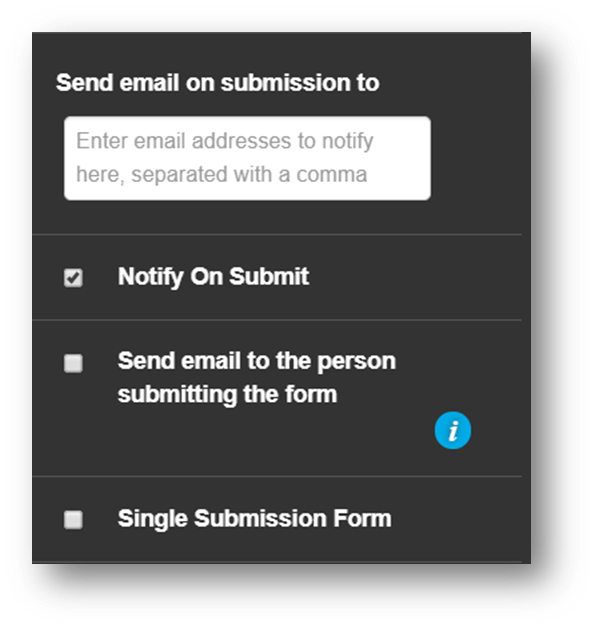
A form can be configured to send any submissions it receives to one or more email addresses. In order to configure the email addresses that will receive form submissions you must be viewing the form widget in a site in edit mode. Expand the Advanced tab of the widget. In the Send email on submission to… field enter the email address or addresses you wish to receive the mail. To enter more than one address, separate each address with a comma.
Viewing Results
All form results are held within the Data viewer. The Data viewer application can be launched from the Site menu, within the Frog bar while viewing a page and selecting the application title context menu option Data viewer.
Exporting form results
Form results can be exported using the Data viewer. Results are exported in CSV format. The CSV will contain the username and name of the user submitting the form and the date the form was submitted, followed by any fields within the form.